Launching the Enhanced User Interface
The Qualys Product Team is excited to announce upcoming enhancements to the Qualys User Interface. These User Experience (UX) enhancements will make your platform experience faster, smoother, and more immersive. We continuously leverage insights from channels like ongoing qualitative and quantitative research, the Product Advisory Board, conferences, the Customer Success Team, and more. We combine those insights with our best craftsmanship to improve your interactions with the Qualys platform. Here are some highlights of this exciting new release.
New Module Picker
For navigational efficiency, we are introducing a brand-new ‘Module Picker,’ which can be invoked with a mouse click on the top-left corner displaying the current module name (e.g., VMDR).
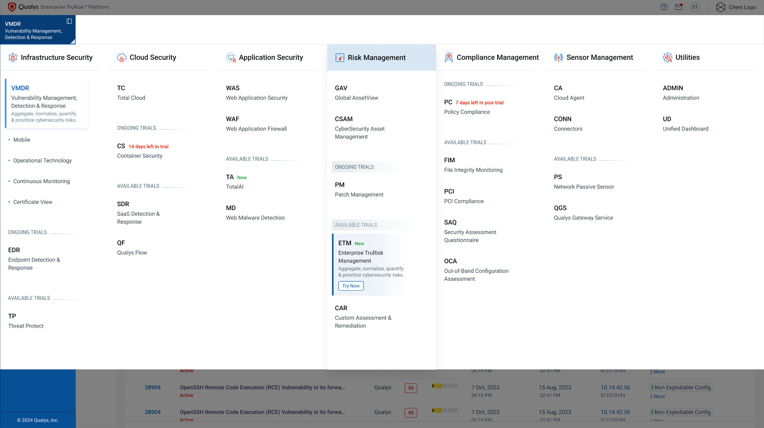
- Module selection is not just faster, but this enhancement provides visibility into all of your active subscriptions, ongoing trials, and what’s new.
- The new Module Picker offers a single pane of glass view of your Qualys portfolio under the ‘Applications’ tab.
- Baselining Miller’s law (that the average human being can recollect up to 7 items (+/- 2) at a time), the modules are now grouped under separate product families.
Improved Platform Navigation
We’ve restructured the platform navigation, making it more intuitive. In line with Hick’s law (decision-making time increases with the number and complexity of options), we reduced the number of navigation options presented to the user up front. We have separated the ‘primary’ and ‘secondary’ navigation.
The updated layout ensures that you can precisely understand where you are within your intended workflow. It comes in handy for finding what you’re looking for without any hassle. Whether you’re just getting onboarded or are a power user, you’ll appreciate the smoother navigation experience.
Primary Navigation
- Now, the left side offers a new vertical ‘primary’ navigation bar. At the top we have added separate horizontal bars offering crisper ‘secondary’ and ‘tertiary’ navigation.
- There is a plan to offer a toggle icon for docking/undocking the ‘primary’ navigation bar. This toggle icon is located within the top-left corner next to the current module name. This toggle option will come in handy for users who prefer to view icons with names.
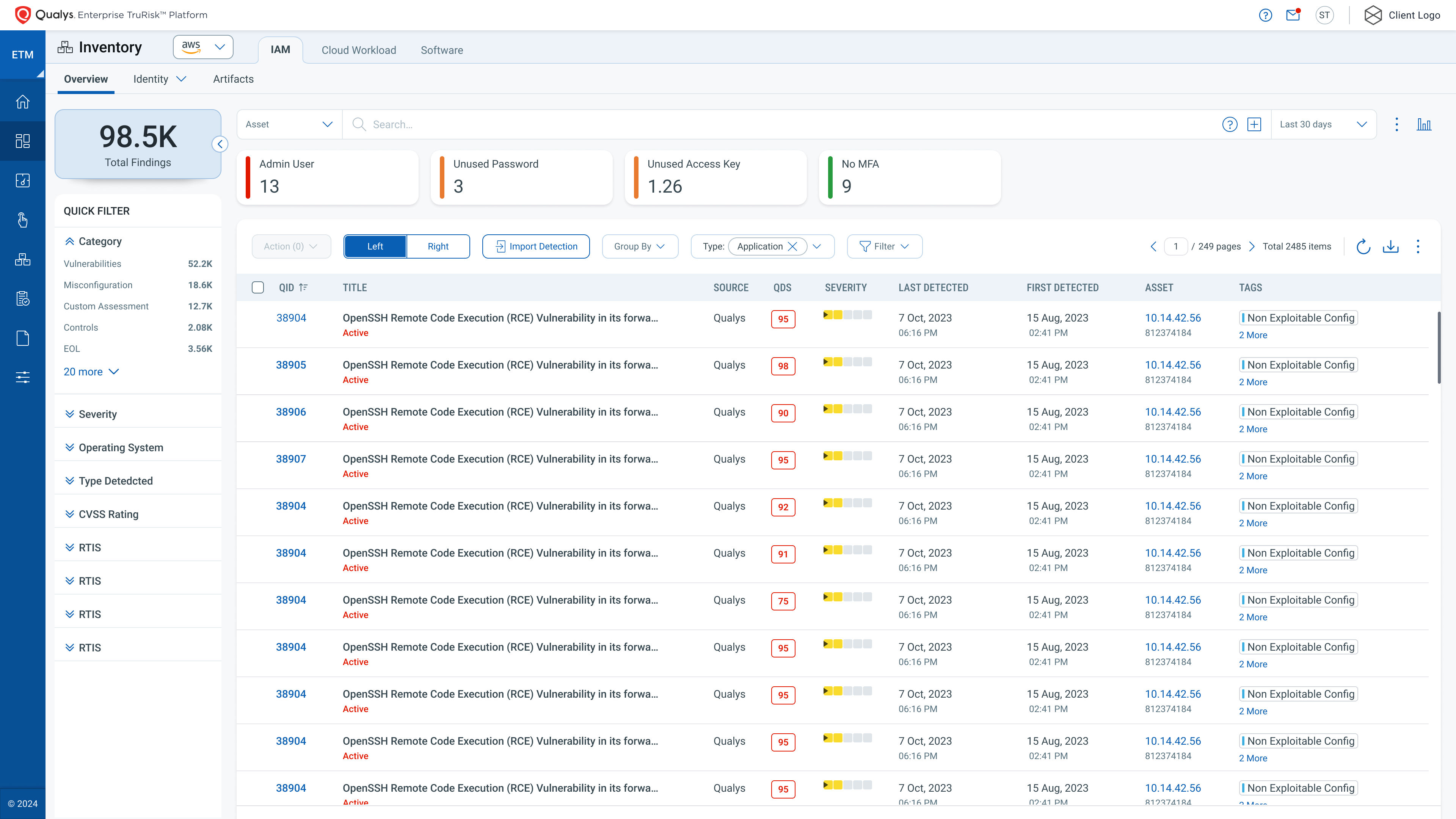
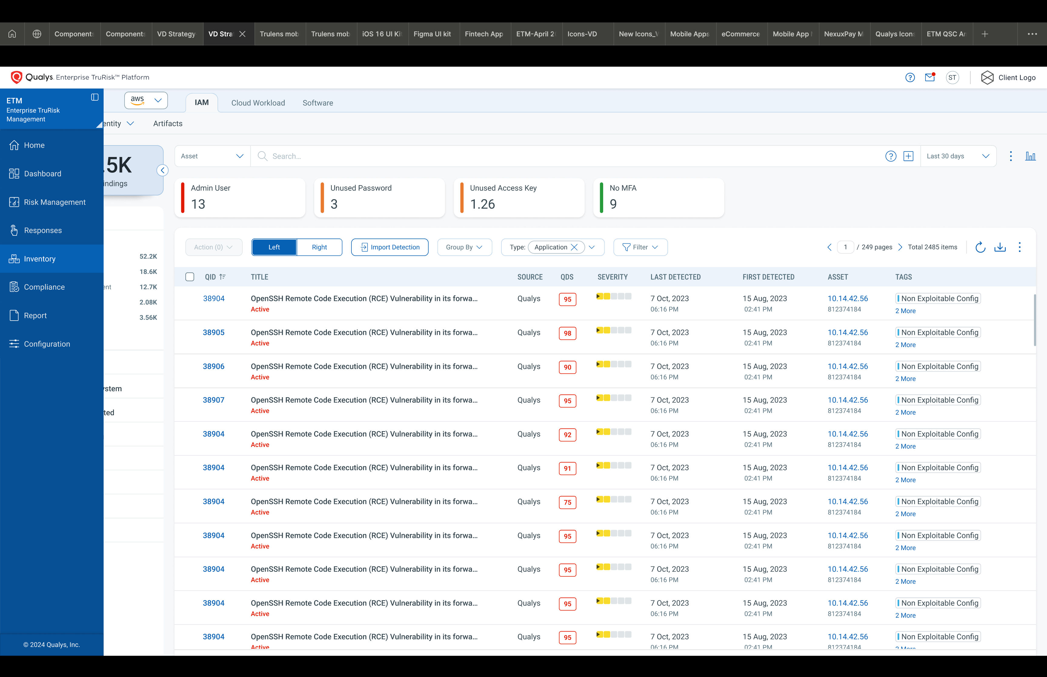
- Initially, the left-side vertical ‘primary’ navigation bar shows a stack of product feature icons. However, the bar offers dynamic expansion on mouse hover, showing icons with names.
- A groove effect with a dark blue background color indicates the currently active feature within the primary navigation. (e.g., ‘Dashboard’ is shown in the below screenshots.)
- Below is the vertical primary navigation bar on left side shown in ‘collapsed’ and ‘expanded’ views, respectively.
The primary navigation tabs like Scans, Reports, Remediation, Assets, Threat Intelligence, Knowledgebase, and Users in the VMDR module are fully updated (including secondary navigation within these tabs) to align with the enhanced UI rollout. This will offer the same User Experience to the users of the legacy VM module. The User Profile, Notifications, and Help sections are also updated.
Secondary Navigation
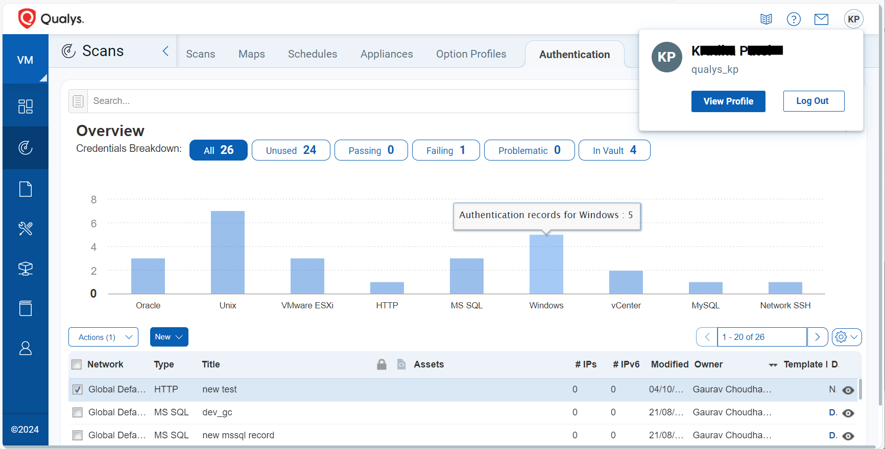
- We now have horizontal bars offering crisper ‘secondary’ navigation for sub-menu options at the top of the screen.
- The currently active tab within the ‘secondary’ navigation is indicated with bold text within a box.
- The ‘tertiary’ navigation is available as required. In cases where 4th level navigation is required, the items are shown as capsules and one selected item is indicated with an underscore.
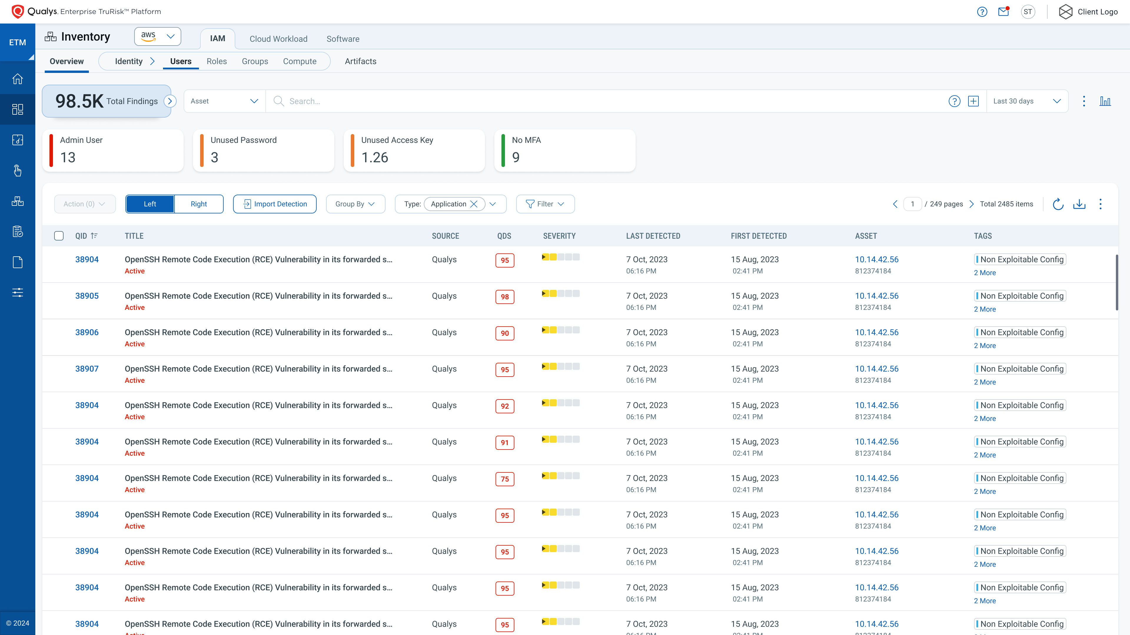
- The various UI enhancements offer improved task efficiency and user interaction across the platform. The screenshot below shows Secondary navigation and collapsible Facet with Count widgets.
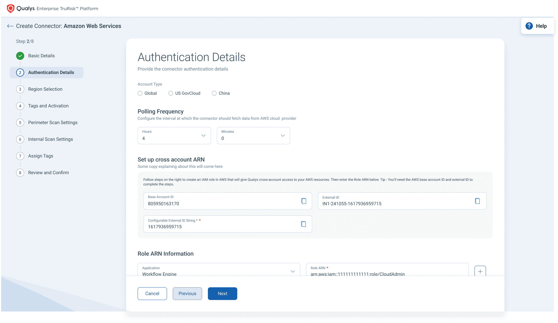
The multi-step wizard has been updated to indicate the progress across a relatively long workflow.
Communication Refinements
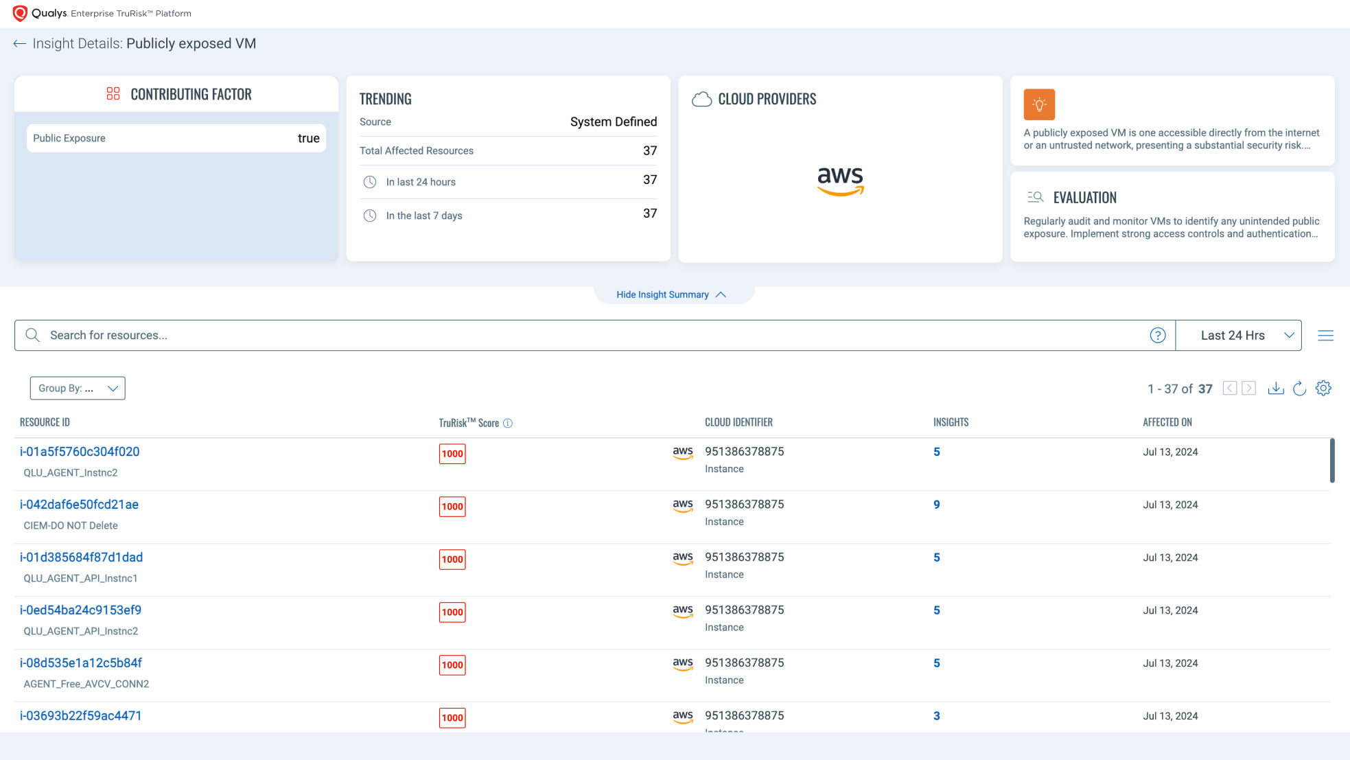
Clear and concise communication is crucial for a great user experience. Applying the chunking principle, we have refined the ‘Communication’ tab (shown as an Envelope), listing two sections.
- The ‘Notifications’ section will list items where your follow-up is expected. These include cases like a required password change, upcoming expiration of an ongoing module trial, when you exceed the allotted license capacity, etc.
- The ‘Messages’ section will list general updates from the platform. These include events like when your scheduled vulnerabilities scanning report is ready, etc.


These refinements in communication will reduce the cognitive load on the user through better information filtering and help guide you to timely action on necessary activities.
Updated UI Components
The refreshed user interface has components and dialogs offering better usability, aesthetics, and seamless interaction. This update will make your time on the platform more efficient and elevate your overall experience. The following are some of the key updates for UI components:
- Refreshed input fields on forms (Search, Date, Email, Text, and Text Area)
- Updated user selection components (Combo Box, Multi Select Combo Box, Checkbox, Radio buttons, Dropdown)
- Restructured modal dialogs that empower you to focus on your tasks with minimal interruption
- Refined overlay screens (one pane, two panes, and three panes) that will enhance your overall experience. The screens are now more intuitive, allowing you to interact with the content without distractions

Refreshed Dashboards
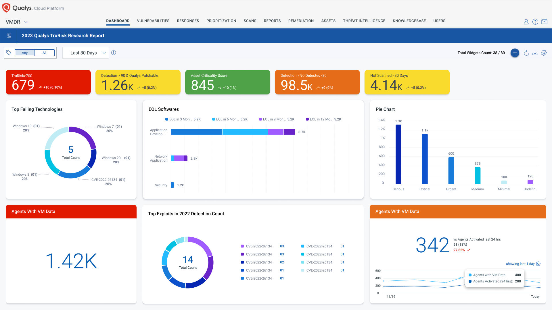
We are also excited to introduce our refreshed dashboard, designed with you in mind. The updates include improvements to accessibility, the color scheme, typography, and hover effects. The team has tuned contrast ratio (text and background colors) and font sizes to help visually impaired users. For effortless information consumption, the User Interface refresh covers the following areas:
- Improved usability
- New look-n-feel for cards
- Refined color scheme
- Better layout of chart legends
Customer Benefits
We are committed to continuously improving and evolving our platform experience. In addition to the more significant changes noted, we have made several smaller modifications to items like animations, tool tips, optimizations for various resolutions, etc. We believe these UX enhancements will significantly elevate your experience with our platform and offer:
- Increased navigation speed
- Reduced task time
- Improved accessibility
- Refined usability and aesthetics
For more information, please contact to contact@smartnet.net.vn
